

SUBJECTS
Fantasy Swords
Fantasy
Classical Guitar
Dioramas
Make Video Games
Model Rockets
Astronomy & Telescopes
Art & Drawing
For Writers
For Webmasters Miniatures
The Meaning of Life
Homebrewing Mead
How to Make a....
series of tutorials
Stop Motion Animation
Fantasy Art School
Terrariums
R/C Airplanes
Fantasy for Writers
Projects
Make a Trebuchet
Make a Paper Castle
Rocket Launcher
Make a Catapult
Make a Terrarium
Shoebox Diorama Sculpting Miniatures
Fantasy Diorama
Shadowbox Fantasy
Make a videogame
Rainforest Diorama
Stop Motion Animation
Make a Volcano
A Paper fantasy game
Make a boxkite
The Warcraft VR Chamber
The Big Wall Diorama
Make a cardboard sword
Dragon Pinata
Nature Walks
MY STORES
Dioramas & miniatures
Classical Guitar store
Telescope Store
Terrarium Store
Fantasy Art Books
Model Rocket Store
Siege Engine Store
R/C Airplanes Store
Swords
MORE
Earning money
with your website
Websites
The Telescope Nerd
The Fantasy Guide
Medieval Castles
Medieval Swords
Medieval Weapons
The knight Medieval
willkalif.com
make-video-games.com
All Materials, unless otherwise stated are Copyright©
Kalif Publishing and StormtheCastle.com
For more information or for customer support check out the copyright and information page
If you have questions
or would like to
contribute you can
---------
| Return to Home Page | |
| Cover Art | |
|
|
|
| Here are some
samples of the first draft cover artwork for my second novel "The
Left Handed Sword. If you want to see what the final cover looks like
you will have to wait until the novel comes out!
|
|
|
Concept 1: The Crossroad This was the first sketch I did for the cover. It came right out without any thought.
I liked this design because it conveyed a sense of the novel on several different levels. There is a lone character standing before a crossroads -which is an obvious metaphor. But I like the fact that the crossing of the two roads also looks like a sword. The shadow of the character is also in the shape of a sword. There is a recursion here that appeals to me. The overall effect of this concept is very dramatic. |
|
|
I continued to tinker with this ide and tried it in oil paints and construction paper looking to get a certain feel.
|
|
| {column1d} | |
| {column1e} | |
| {column1f} | |
| Concept 2: The Sword | |
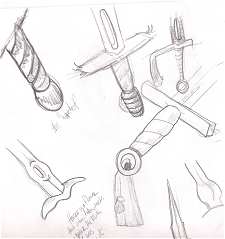
| The sword itself is an important part of the book and I wanted to bring it, and a little bit of its qualities onto the cover so I tinkered with some concepts here. | |
 |
|
|
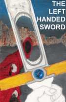
You can see in the sketch above there is one sword with a hole in the pommel. Through this hole you see the hooded head of a character. I liked this and developed it further. It ended up coming to a more finished scene shown below. |
|
 |
This is a pretty good mock up. Not complete but I liked the design and it gave you a sense of the sword and of one of the characters in the book. |
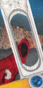
| Here is a closer look. |  |