Sticking with it: an example of a website
If you are developing a website and doing most of it yourself, and this is probably exactly what you are doing because it is the low cost way to do it. But you may be running into the dual problems of learning how to make a website and how to make a website that actually looks good. It's a bit of a tricky thing to achieve because it's like learning how to play a musical instrument - You can't really play any songs until you learn how to play the instrument and the only way to learn how to play the instrument is to try playing songs.
What I am saying here is that your first ten website attempts, or 20, or 50, may not be very good. And this is totally normal. You are learning a lot as you go and this process is exactly what I have gone through.
Here is an example of a website that I own (All Things Medieval). It focuses on medieval weapons, armor, castles, knights, etc. And I while I have had this website for a while it was pretty much a plain white site with a few pics here and there and a lot of content in the form of essays, articles and the like.
I have really wanted to redesign the site to make it look reasonably professional. So I did, but I just didn't sit down and code out the new site. It was a developmental process that took quite a bit of work over the course of a couple of months.
My point here is that your website will change and improve as long as you keep after it. You will learn things and understand things better. Your eye will see things better. You will ask questions that will make your site better.
So, stick with it. Get your site up, improve it and work on it some more. Re-design it as you learn and then re-design it some more. Put it away for a week and work on other stuff, then look at it again and re-design some more.
Here is an overview of the site I redesigned and I explain some of my thinking as I did it and what I did.
The current final version of the site:
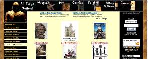
You can check out this website here: All Things Medieval
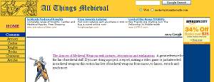 This was my first attempt at the new design. It was interesting and I hit some of my major points but the final version looks a lot different than this!

The Yellow/blue and the squared off feeling was a bit too clinical so I tried a bit of a curvy look to it. Not bad but it just didn't seem clean enough - particularly the color scheme.
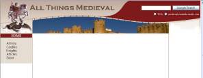
Not ready to give up on the curvy I changed the color and tried adding a graphic into the empty space.
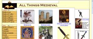
I just wasn't getting curvy to the way I wanted it. It was too difficult to fill in the curved spaces with content so I switched back to a square feel.
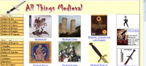
Was showing potential, tried different banners at the top and started to define my table of contents navigation links.
This attention to navigation is so important. As you develop your website you are going to realize you need to make it clear and easy for your web visitor to find the stuff on your site. You will pay a lot of attention to this navigation ease and how it blends with the look of the site. You can see here that my table of links on the left is actually broken into sections. Top six links then a space then more links. I made a logical collection of links here. As the site develops I make this even easier to understand.
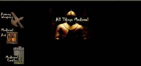
At this point I experimented pretty wildly. I wanted to really try to get more of a medieval feel to the site so I tinkered with black and with empty space. This version here is just one of many different layouts I tried.
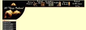
Now I am trying to combine what I have learned so far. Can I keep the golden knight and a bit of the black? Yet still retain all that I want when it comes to usability and navigation? Notice the new set of index links at the very top.

Okay, dropped the last semblance of a curve and squared everything off. It is now starting to look like my final version. Navigation, look and feel are coming together.
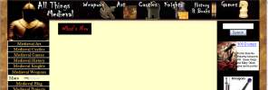
Yup, pretty close to where I want it to be. Now I am experimenting with visual clues like a whats new box, placement of a search engine, products, ads and other functional items.

And there you go. Everything is to my liking and this is the currently live version of the site. Of course I will make changes over the course of time but it has come a long way from the first yellow version!
While you are developing your site you are going to get a better understanding of what you have to offer and how to best present this to your web vistitors.
My point here is that you should not get discouraged - keep trying and keep working at it. As a human being you can't help the fact that you are going to improve and from that so will your website!

SUBJECTS

This is a Stormthecastle.com website
- Avoiding the Number One mistake that new webmasters make
- The concept of "Intent to Purchase" and how it will make you more money
- How to easily put adsense ads on your blog using a plugin
- My Free pdf: The webmasters crash course on how to make money with a website
- Affiliate Programs to sign up for and earn money with - They are free!
- Identifying multiple benefits to maximize your time and your income
- Piggybacking and prognosticating: Two techniques for increasing revenue
- Tips on Increasing Holiday Sales from Affiliate programs like Amazon
- How to make money playing video games
- Put a free photo gallery on your website
- Put a form on your website so you can have a contest and build an email list
- Put the new google video ads on your website
- Working with Google and getting Google to work for you! (Sep 21 07)
- Adding the Unspun widget to boost amazon book sales
- How to add audio messages to your site -
- An example of the development of a website How I started and how I ended
- A basic primer on metatags, how to do them
- Make a robots.txt file -
- Thinking creative
- Create HubPages
- The webmasters list of creative ideas
- take the test:
- How to post a youtube video to your website or wordpress blog
- The tutorial to end all tutorials: How to make money with a website without spending a dime
- Making banners for your website
- How to Make your website a success in three simple steps
- About my new website for creative webmasters
- Use the ebay free affiliate program (Jan 28)
- How to monitor your web traffic for free
- Naming your webpages -
- Keyword laddering -
- Rafting the Amazon. How to get affiliate code onto your website (Dec 22)
- The best way to drive traffic to your website is...
- Optimizing graphics, a must for all webmasters
- The important thing about google that nobody talks about
- Put a newsfeed on your website in 5 minutes flat
- Open a free Amazon Astore for your site
- Why and how to add alternate ads to your google adsense ads
- Table of Contents for the Tutorial
- Introduction
- Checklist for what to do
- Brainstorming ideas for your website
- get a free site
- get a paid site
- choosing a domain name
- get free web design software
- ftp your website
- Now let's add some awesome content
- Join the free Amazon. com affiliate program
- Open up an amazon Astore for free
- Register with search engines
- Creative ways to advertise and promote your site
- Guestbooks & Bulletin Boards
- Write essays
- Submit to directories
- Google adsense
- Feedback- tracking your website progress
- Spider friendly design -
- Keep tables straight
- How to register a domain name
- STAY MOTIVATED
-
Here are some great website ideas for making money -
- Review Movies for profit - Can you write movie reviews? Heres how to do it.
- Book Reviews for profit
- Tutorials are a big money maker
-
Recommended Books web design, google, amazon, search engine optimization - A little information can go a long way
-
Money Making Advanced Topics -
- Keywords and more keywords
- Design for easy search engine crawling
- Using a sitemap
- Google ads: Place them on the page properly to increase your sales
- Advanced article writing
- Vegetarian Dragons -
- Ancillary Products -
- List of Affiliate Programs to join
- Podcasting
for profit
- All Materials, unless otherwise stated are Copyright© 2001 -2015
Kalif Publishing and StormtheCastle.com If you want to reproduce any of these articles you may do so if you follow the rules on the copying my articles page here - If you have questions
or would like to
contribute you can
---------
- How to register with search engines to drive traffic to your site
- Swapping Links with other webmasters
- Basics of clean web design
- Modify your 404 page - very important
- Basic web design software for free
- Stop Making excuses and just do it
- Keeping Tables straight