This article and this map are written by guest writer Roberta Osborn. She has also written an excellent article on how to create and use invented language in your novel. You can read it here: Using invented language in your novel Look for her soon to be published Science Fiction novel Chaos and Reunion.
By Roberta Osborn

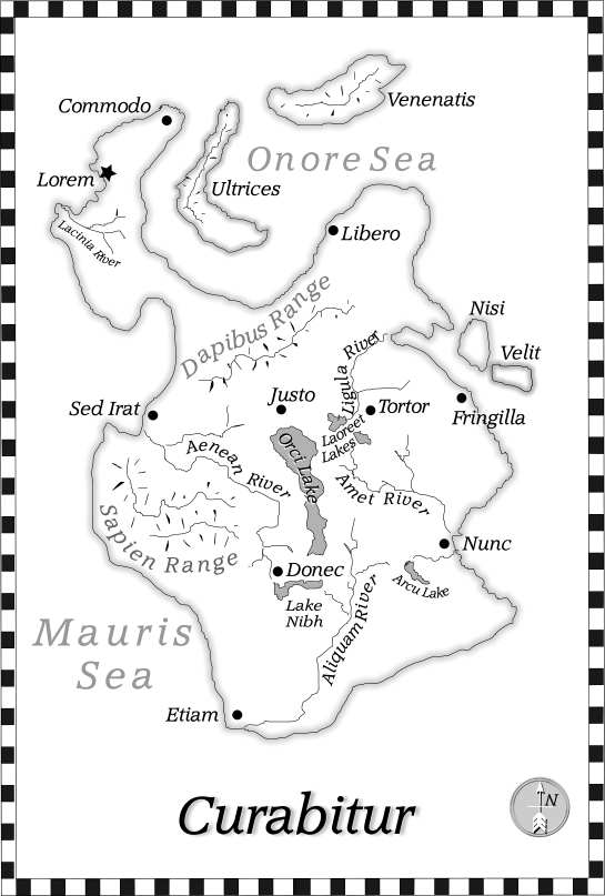
See a larger version of this map at the bottom of the page. |
The following describes the process I used to create maps for my novel Chaos and Reunion after it was finished, and the lessons I learned. It would have been more helpful to my writing to have worked on the maps as I wrote my book, but that is just the first lesson learned.
- You don't need to be able to draw to create a good map. (Random, ragged coastlines are more realistic than smooth ones.) Paying attention to details and being consistent are more important skills.
- Obtain and get familiar with a graphics software product. I am very happy with Xara Xtreme Pro, but there are many possibilities. The features of your software tool will make reproducing specific map features easy or difficult. Support for layers, grouping and resizing objects, and formatting text and laying it out on a curve are capabilities that you will definitely appreciate.
- Get a Wacom (a $100 USB computer pad and pen device) if possible-it is so much easier to draw with than using a mouse.
- Google - Images "world map" and look at all the styles. Pick just a few style features that you think you can create successfully in your software tool. Try them out. Use what you like and what works. You don't need many tricks to create a good map. a. Pay attention to the various ways the professionals lay out the text, the directions, spacing, fonts, and sizes they use.
b. Pay attention to the scale of detail and the level of roughness of coastlines and rivers.
- Some easy stylistic features include:
a. A title
b. Page borders
c. Shadowing of landmasses
d. Simple topographical indicators, like lines perpendicular to ridge lines to indicate mountain ranges e. A compass
f. Scale (I carefully avoided using distance measures anywhere on my planet, so I did not include a scale.)
g. Quality of line-some software allows you to create lines that have brush-like or freehand-like variations in thickness. This can create a fluid, artistic look in your map.
- Decide whether your map will be color or black and white/grayscale. I recommend grayscale to keep the cost of printing your book down and keep the file size of your e-book down, if you are worried about that. Using grayscale means using patterns or shades of grey instead of color to represent some kinds of information, such as bodies of water, if desired.
- Search your story for all mentions of direction (east, west, north, south, etc.), cities, mountain ranges, plains, other geophysical features, rivers and bodies of water, roads, trails, etc. These are all candidates to be shown on the map (and in your glossary, if you like-make sure the spelling matches). List them with a little bit of context.
- Referring to your list, draw your map by hand with pencil and paper. Erase and redraw as much as you like. Start with a comfortable size of paper, but remember, eventually, this will have to get down to book page size. (Alternatively, you could try drawing directly into your graphic software.)
- As you are drawing and labeling, make sure your story sticks together. If it is impossible to draw an internally consistent map, maybe there is a logic flaw in the text. Fix your story if you need to.
- If you are creating a map to occupy one page, try to orient your landmass such that it occupies as much of the page as possible-you can still display your map in portrait mode by reorienting the text and compass. Your map will be larger and easier to read.
- (See example.)
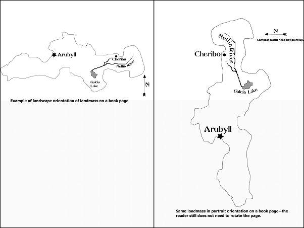
- If you are laying your map across two pages, bear in mind that the middle of the map will be obscured in the crease of the book-spread the map features away from the middle so you don't lose anything.
- Once you have a paper draft that makes you happy, you need to get it into the computer. Lay your drawing over your Wacom and trace it into your graphics software. To get the most realistic coastlines, be sure to use very little or no automatic curve smoothing.
- Legibility at small sizes is the most important characteristic of the font you select. Do not sacrifice legibility for style. Think "suggests a style" instead. Your readers will get it. There are many, many fonts available. Pick a font that isn't too "thready" and isn't too "dense"-be sure you can read it on the size of your page, and in all the sizes you will be using. Imagine that this map will be printed in a cheap paperback version-what will it look like then?
- If you can lay text out on a curve, your software may very well allow you to adjust the spacing between letters as well. This is extremely useful in fitting text legibly along winding rivers.
- I recommend sticking with a single font, varying it by size, spacing, boldness, and potentially italics. This gives a consistent look to the map.
- If you are placing text over a grey background, be very careful to create sufficient contrast. One trick is to duplicate the text object in the opposite color (create a white copy of black text or vice versa), and put it behind the text, allowing just a bit to show along the edge. This will make black type stand off better from a dark grey background, for example.
- Once you have a working electronic version of your map, export it as a *.jpeg, *.tif or *.bmp file in the highest resolution available, paste it into a word processor document, size it to the size of a book page, and print it. This will give you the opportunity to see how well it "reads." For example, do your patterns work, if you used them? If anything is hard to distinguish or illegible, you should fix it. A little bit of trial and error is very instructive at this point.
- Be careful not to confuse graphical complexity with information. For example, in the diagram below, A does not convey more information than B. In fact, the bend in A conveys the illusion of additional information, without adding anything of real value-it actually interferes with getting the quickest grasp of the content.

This article and Map are Copyright© 2009 Roberta Osborn, All Rights Reserved
 How to Make a Fantasy Map - With Video! How to Make a Fantasy Map - With Video!
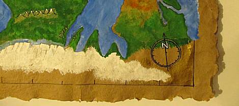
In the previous tutorial we made a big sheet of paper. Now, in this tutorial we turn it into a map of a fantasy world. I show you tips and techniques on how to do it and I also have a video. How to Make a big Fantasy Map
Resources for Writers
World Building (Science Fiction Writing) This book is designed to give science fiction writers the solid grounding they need in real science to make their fictions read like fact. World Building is a blueprint in words, calculations, tables and diagrams to help writers transport readers from one world to another. This book is designed to give science fiction writers the solid grounding they need in real science to make their fictions read like fact. World Building is a blueprint in words, calculations, tables and diagrams to help writers transport readers from one world to another.
  Alchemy with Words: The Complete Guide to Writing Fantasy vol 1 (The Compete Guide Series) (Volume 1) Alchemy with Words: The Complete Guide to Writing Fantasy vol 1 (The Compete Guide Series) (Volume 1)
  How to Write Science Fiction & Fantasy How to Write Science Fiction & Fantasy Orson Scott Card's Hugo award-winning classic on the art and craft of writing science fiction and fantasy is available in paperback! Card provides invaluable advice for every science fiction and fantasy writer interested in constructing stories about people, worlds and events that stretch the boundaries of the possible...and the magical. They'll learn: * what is and isn't science fiction and fantasy, and where their story fits in the mix * how to build, populate, and dramatize a credible, inviting world readers will want to explore * how to use the MICE quotient--milieu, idea, character and event--to structure a successful story * where the markets are, how to reach them and get published There's no better source of information for writers working in these genres. This book will help them effectively produce exciting stories that are both fascinating and market-ready. Orson Scott Card's Hugo award-winning classic on the art and craft of writing science fiction and fantasy is available in paperback! Card provides invaluable advice for every science fiction and fantasy writer interested in constructing stories about people, worlds and events that stretch the boundaries of the possible...and the magical. They'll learn: * what is and isn't science fiction and fantasy, and where their story fits in the mix * how to build, populate, and dramatize a credible, inviting world readers will want to explore * how to use the MICE quotient--milieu, idea, character and event--to structure a successful story * where the markets are, how to reach them and get published There's no better source of information for writers working in these genres. This book will help them effectively produce exciting stories that are both fascinating and market-ready.
  The Writer’s Complete Fantasy Reference The Writer’s Complete Fantasy Reference
  Plot & Structure: (Techniques And Exercises For Crafting A Plot That Grips Readers From Start To Finish) (Write Great Fiction) Plot & Structure: (Techniques And Exercises For Crafting A Plot That Grips Readers From Start To Finish) (Write Great Fiction)
|
![]()


![]()

